These images are from my next visit to the club in which i "got closer" to the stuff on the walls and whatnot as instructed previously in Waterloo.
This image below I like except for the table. It's neither in nor out. I think the cream and green colours add quite a nostalgic feel i think. Especially as the celtic shirt on the wall also ties in with this colour scheme.
This doesnt fit as the perspective is totally different from the rest. Even tough the focus was suppose to be on the stuff behind the chairs but it doesnt come across like that and so doesnt work.
This was suppose to be about the hand written signs on the door but I didnt get close enough.
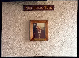
I like this shot, it is of a dedication of a booth in the Spen Hudson Room that "Dolly" always sat in. I think it adds, like with the Sedge McClelland plaque, to the sense of how close knit the communities are in these clubs.
I reshot this to better frame and light it. Before there was both natural light from the right and strong tungsten light from the left which made it impossible to colour balance, it looked odd and the tungsten light doesn't fit with anything else I've shot in this club.


